Side Menu Update
Sniip Side Menu Update

Update Overview
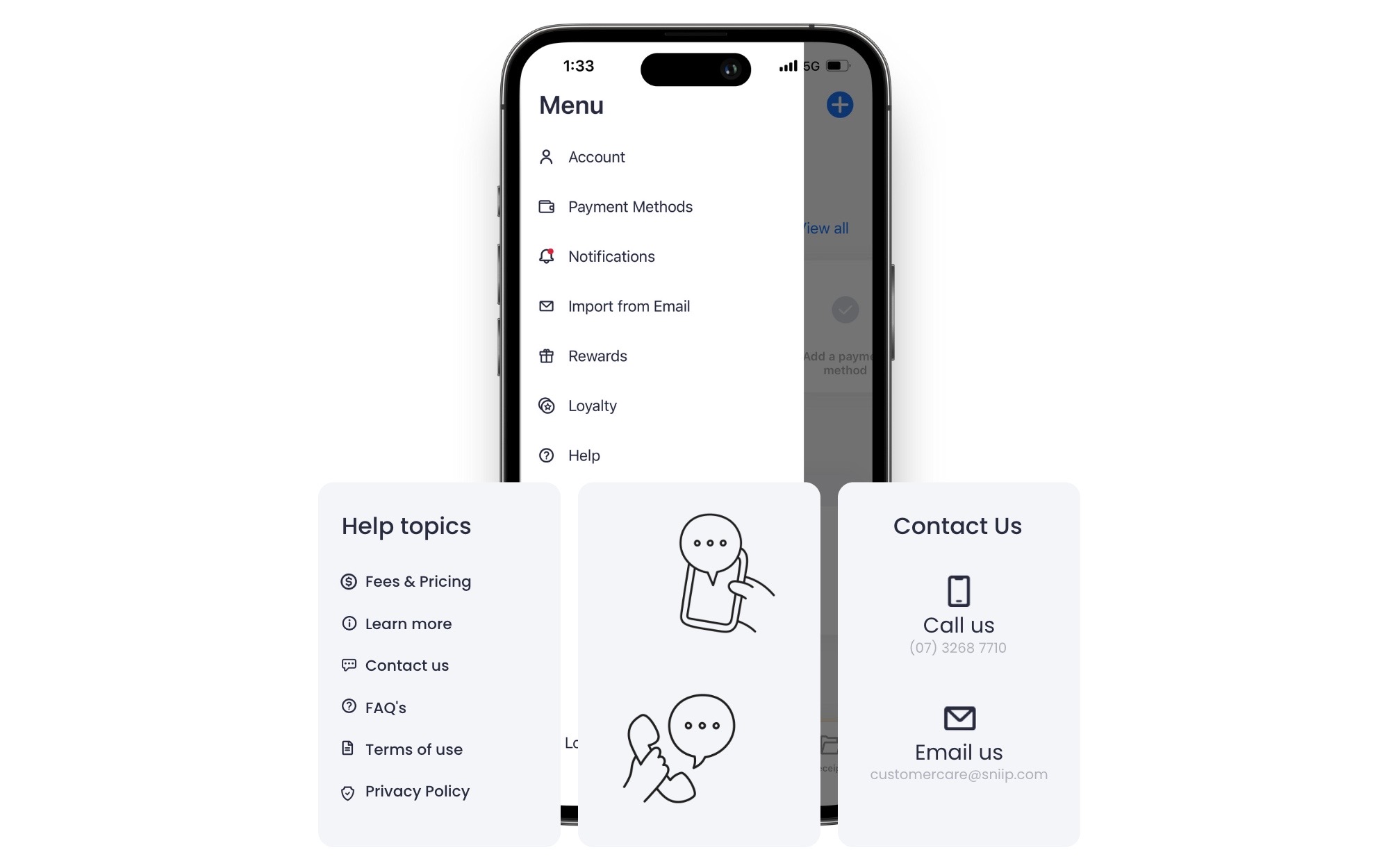
After updating your Sniip app, you’ll be able to view a short, interactive video demonstration of the changes we’ve implemented! These changes include:
- We removed the ‘close’ button
- Icons are now on the left side to improve readability
- A ‘Help’ hub has been added to the menu
- The ‘Log out’ button added to the bottom of the menu
With a bold decision, we’ve bid farewell to the traditional ‘X’ exit icon located at the top of the menu. Embracing a more user-centric approach, we introduce a noteworthy enhancement to the menu’s functionality and convenience.
From now on, navigating away from the menu is effortless and intuitive. You are no longer confined to searching for the small ‘X’. Now, you can simply swipe left or tap anywhere outside the menu to close it. This process ensures a seamless user experience, allowing you to focus on what matters most. Say hello to improved navigation and a smoother interaction with our revamped functionality!
We understand that sometimes questions may arise while using Sniip. And we pride ourselves on our prompt customer support. That’s why we’ve added a dedicated ‘Help’ hub to the menu. Now, getting in touch with our support team is just a tap away!
Whether you have a query, need assistance, or want to provide feedback, our team is here to help you every step of the way.
basically as a matter of fact
because as a result
before as an illustration
besides as can be seen
but as has been noted
certainly as I have noted
chiefly as I have said
comparatively as I have shown
concurrently as long as


